From catalog to a true ‘blank canvas’: user defines the flow
In my last post I added a persistent DuckDB catalog and a self-serve onboarding pipeline. Schemas and joins are now grounded in measured SQL evidence, so any dataset can be onboarded and queried right away. That led me to the next step of making the agent a true ‘blank canvas’: the agent should handle flexible maps, charts and visualizations without enforcing a rigid set of ‘screen flows’ on the user.
Buyers don’t care about dozens of tables sitting in DuckDB. Buyers would rather see floodplains, bike infrastructure and demographics overlaid on a map than ask a SQL chatbot about each one. They’d rather see whether a neighborhood is getting safer than stare at ten years of crime history blurred into one number. When buyers ask the agent to compare candidate homes, a 50-line markdown table inside a chat bubble is not what they had in mind.
With the help of Claude I brought in a few fundamental changes: moving from a catalog backend to something you can actually look at and click around in.
Map layers straight from the catalog
In earlier versions (Extending the house-hunting agent) every map layer needed a hardcoded endpoint, a custom GeoJSON parser and a hand-written color ramp. If you onboarded any geo dataset other than the predefined / preparsed data (Eg: a municipal parks or zoning dataset), it stayed in SQL and never reached the map.
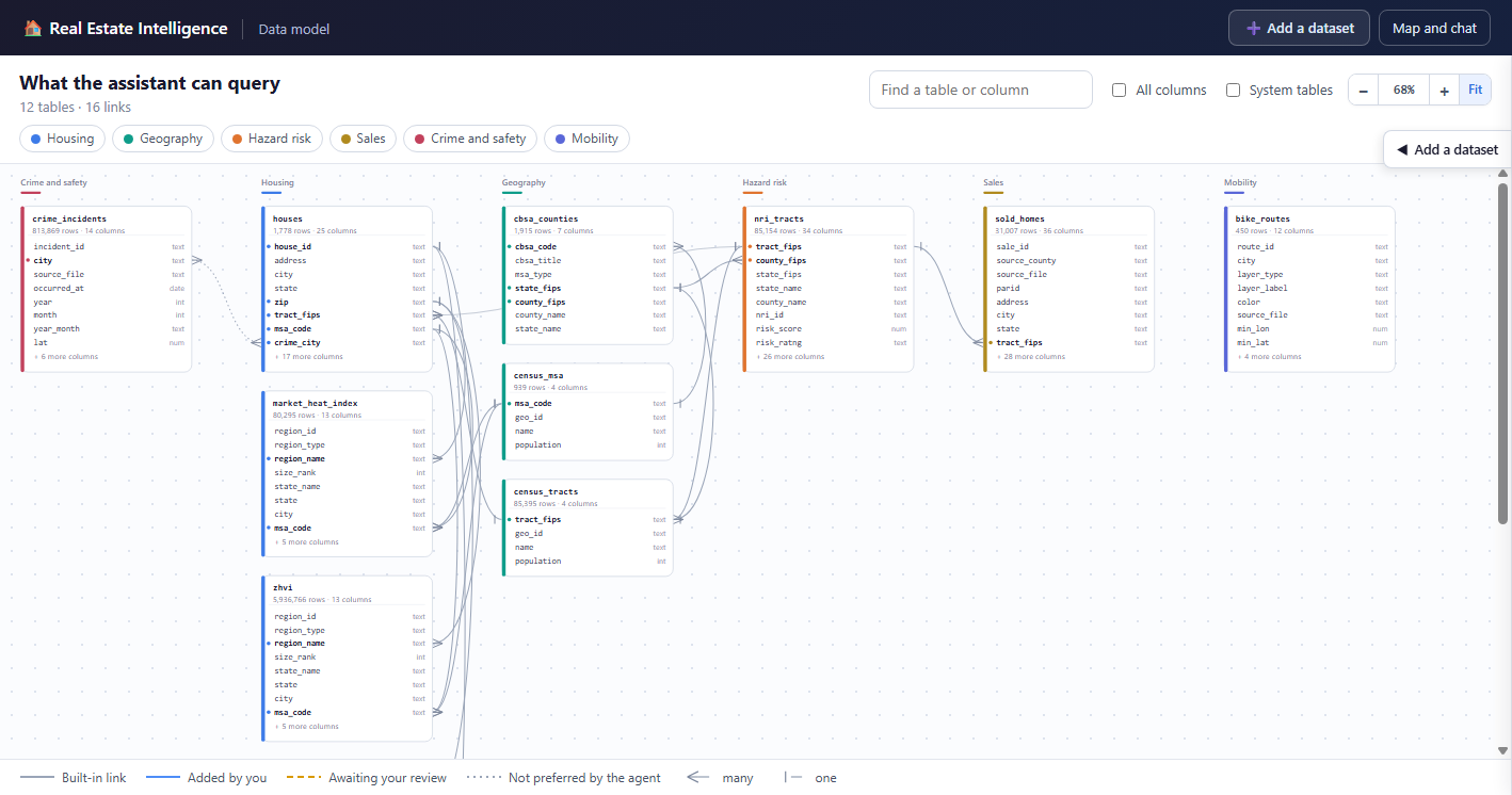
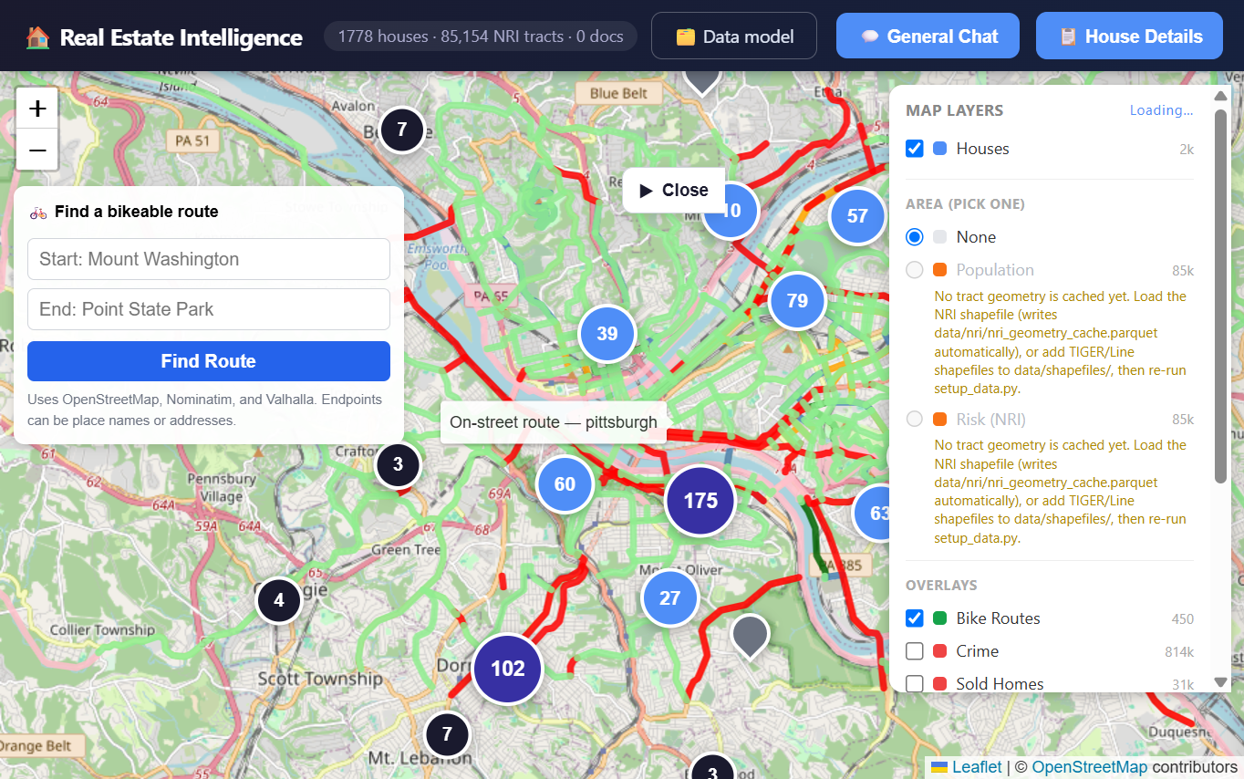
I replaced that with a ‘layer classification’ engine driven by the catalog. The backend checks each approved table for three things:
- Point coordinates: sanitized latitude and longitude pairs
- Tract boundaries: a relationship to Census tracts through
tract_fips - Native vector geometries: polygons or lines, like the BikePGH cycling facilities
Depending on what it finds, the table is registered as a point cluster, a choropleth or a line network in a grouped Map Layers panel. Switching on a tract-level dataset joins its measures to cached tract geometry on the fly and draws the choropleth. No new frontend code.
Crime over time
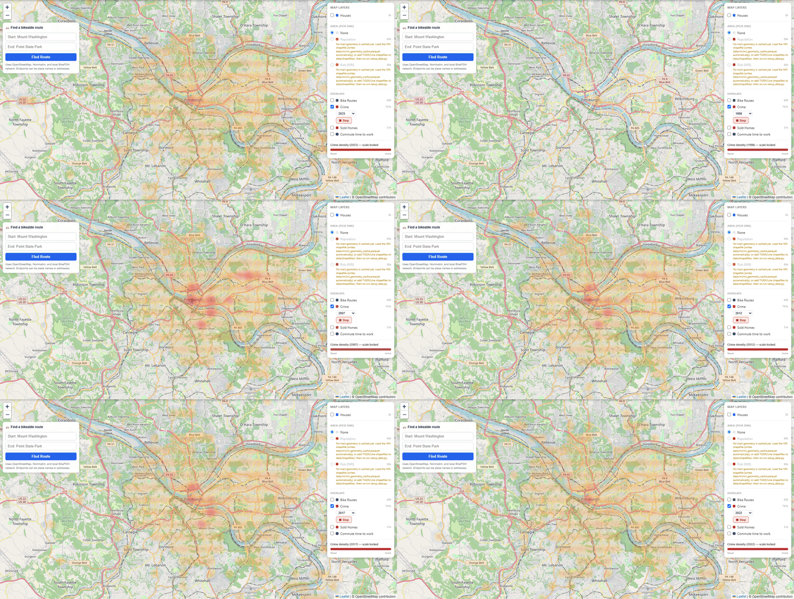
My first crime layer was a kernel density heatmap over every historical incident. Aggregating crime data over years is uninteresting - dense commercial areas stayed dark red whether property crime had dropped 40% over four years or jumped last month.
So the layer engine now does temporal slicing. Tables with a time dimension get a dropdown of observation years, and an Animate button steps through them, interpolating the density grid as it goes. Watching incidents shift from 2016 to today turns a scary blob into a trend line, which is what a buyer needs to judge where a neighborhood is heading.
Tables, charts and maps instead of walls of text
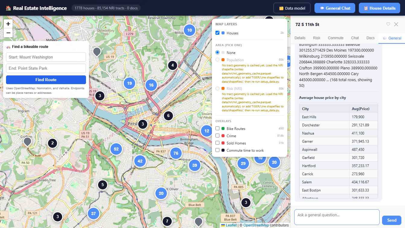
In Sharpening the house-hunting agent I settled on a rule: the LLM writes text, and deterministic code decides what is true and allowed. Answers still had a wall-of-text problem, though. Ask for a comparison of five neighborhoods and the LLM would hand-build a huge markdown table inside its reply.
The fix is a presentation layer with a per-turn artifact bus (agents/artifacts.py). Approved tools put result DataFrames or spatial collections on the bus. A deterministic classifier, classify_dataframe, looks at the row count, the column types and whether coordinates exist, then emits a table, chart or map artifact. Some operations emit several in a row: crime-aware bike routing sends the crime-density overlay first and the route line after it.
That leaves the LLM with the one job it’s good at, a short qualitative takeaway. The numbers go to sortable UI widgets.
Valuation with Zillow ZHVI and market heat
A listing price is an asking price. It doesn’t tell you what the home is worth or how much room you have to negotiate, so I pulled in two datasets from Zillow Research:
- Zillow Home Value Index (ZHVI): monthly price history by ZIP, city, metro and county
- Market Heat Index: inventory velocity and price cuts, a rough read on buyer vs. seller leverage
A parser for wide-format time series normalizes the monthly files into DuckDB, and the agent now runs a 3-tier valuation. Tier 1 indexes a property’s previous sale price forward along the ZIP-level ZHVI appreciation curve. Tiers 2 and 3 fall back to metro-level trends or baseline comps when the ZIP data is thin. In the House Sidebar and in chat you can see whether a home is priced above its neighborhood’s appreciation curve, and whether market heat gives you any leverage.
Keeping the data fresh
Real estate data goes stale fast, so the Data page now has a Data Sources Registry with direct download links and step-by-step instructions for Redfin, Zillow and county open-data portals (plus HTTP health checks that flag upstream URLs that broke or moved). Refreshes go through a transactional orchestrator. It validates the schema first. If an incoming file is malformed, it rolls back.
Putting it together
A typical session now goes like this. You spot a house on the map, with school attendance boundaries, bike facilities and FEMA flood risk layered around it, then open the crime overlay and animate the last five years. In House Chat you ask for a price assessment, which uses the ZHVI curve and market heat. In General Chat you ask for a comparison of candidate homes and get a short takeaway plus sortable table and chart artifacts. When new listings drop, one click refreshes the database.
The agent started as a conversational proof of concept. It’s now something serious buyers can rely on day to day.
Code is on GitHub. None of this replaces walking the neighborhood or hiring a home inspector, but having a verifiable, extensible data model makes navigating complex markets far more manageable.